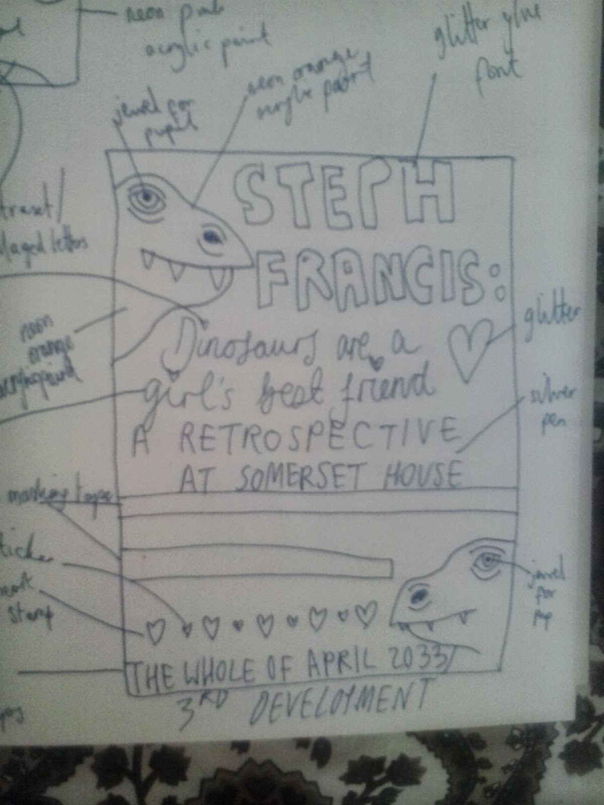
The last day resulted in the culmination of the designing of our retrospective poster. I completed a series of initial designs which I then chose my favourite to develop. The basis of my retrospective poster was an exhibition of mine in 20 years time at Somerset House and features fashion and illustration named 'Dinosaurs are a girl's best friend'. After developing a design, I did a tester page to check if things would work out and all the elements of my design process can be seen below in the photographs. I am really pleased with how my design turned out as I feel it perfectly encapsulates my style and reflects the joyous, light hearted feel of my work. In the afternoon of Day 3 of the graphics pathway, we had a group crit in which we discussed the different posters we created and evaluated what we had learnt over the week.
 |
| my finished poster |
 |
| The front of my mock exhibition leaflet I made as I had spare time |


I really enjoyed this post because it allowed me to look at your initial thumbnails and transitional thoughts and then your final poster. This means I can see your process and understand why you decided to do something in a specific way. It seems you have been able to create this in efficient time due to the fact you had extra time to create a leaflet which infact matches perfectly with your poster. The poster and the leaflet both sums up you and this is something I have gathered from witnessing you acumulate this blog from the beginning. The different thumbnails is what I like the most about this blog because there is a defiant play on composition and image which expands your concept something important in all design fields. From doing this experimentation of your poster design you were able to choose the best one to create your final piece. I think the poster is really interesting and sums up your style which I hope you will keep developing for another 20 years. If I could suggest anything I would have liked you to choose a different background colour perhaps maybe green like your leaflet because it works so well. And perhaps you could have added a thicker pen for your type so it stands out as much as the dinosaurs which are stunning. Overall I feel your poster has achieved a lot and has been able to sum up you.
ReplyDelete